Poco’s Email Review: Does This Welcome Email Reap Its Just Rewards?
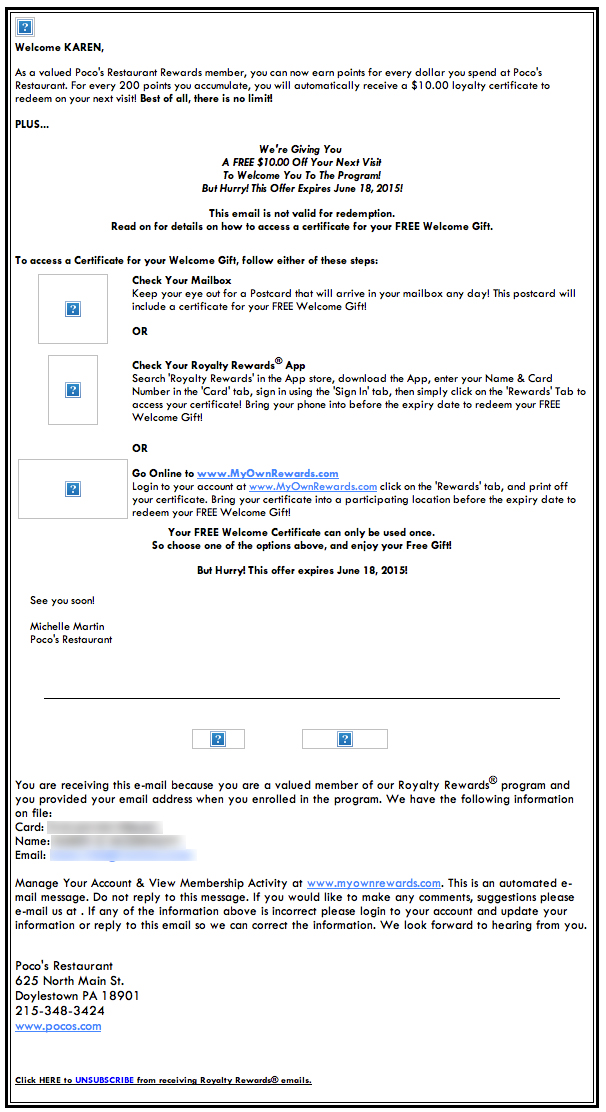
Preview without Images
Preview with Images
Poco’s Email Grade: [D+]
Subject Line | 3 |
Preview Pane | 2 |
Eye Path | 2 |
Clarity of Message | 3 |
Call to Action | 1 |
Offer | 3 |
Credibility | 2 |
Sense of Urgency | 3 |
Email grades are calculated on a 5-point scale, where 5 = A and 1 = F.
August 6, 2015 –
Organization Overview
Poco’s is a Mexican-American restaurant and bar located in Doylestown, PA. According to its website, Poco’s has been in business for more than 28 years and is known for having an “up-beat, funky and eclectic attitude and atmosphere.” In addition to serving Southern California–style Mexican cuisine, Poco’s also offers a selection of appetizers, burgers, steaks, ribs, salads, and more.
Subject Line May Appear Suspiciously Spammy
This email was sent as a welcome to a Poco’s customer who had recently signed up to become a member of the restaurant’s new rewards program. While the From line lets recipients know that Poco’s is the sender, the subject line — “KAREN, Welcome!” — indicates that this is a welcome message.
The subject line is personalized and includes the rewards member’s first name. Although personalization has been shown to be an effective way to drive conversions, the use of all-uppercase letters for the name may appear suspiciously spammy to some recipients.
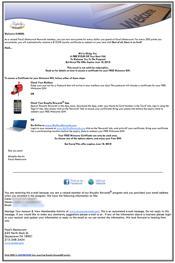
Eye Path and Preview Pane Lack Focus
In the preview pane without images, however, Apple missed an opportunity by not using alternative text in the main image box. More important, the primary call to action – “Buy Now” – has been omitted.
But is the call to action necessary in this email? Maybe not, especially given the excitement and anticipation that has been building with this product release. Even if the images didn’t automatically download for recipients, potential Apple Watch prospects would likely make an effort to see more.
Clean Eye Path & Clear Email Message Support the Conversion
When recipients open the email, they don’t know where to look. The primary information about the offer and the offer’s expiration date is bold and centered; however, it doesn’t stand out because its font size and color are the same as the rest of the email copy. In addition, Poco’s logo is conspicuously absent, which makes it difficult for recipients to know instantly who the message is from. Apparently, a third party — Royalty Rewards — handles the rewards program and associated email promotions. The Royalty Rewards logo is the only one included in the email.
An effective eye path in an email typically guides a reader’s attention to the primary call to action. In this email message, there really isn’t a call to action. However, three options for how to access the “Welcome Gift” are provided: checking your mailbox for a postcard, checking your Royalty Rewards App, and going online to check your Royalty Rewards account. Clicking the mobile phone icon takes recipients to the Royalty Rewards App download site, whereas clicking the computer icon takes them to their Royalty Rewards Membership Account.
Similar to the email’s eye path, the preview pane without images also lacks a central focus for recipients. Plus, no alternative text was used for the images, providing little enticement for people to download the images.
Strong Offer, But Not Effectively Promoted
There’s a strong offer (a $10 certificate to be used the next time the customer visits Poco’s) and a solid sense of urgency (a bit more than a month to use the certificate). Both the offer and sense of urgency, however, could have been promoted more effectively. For example, letting recipients know about the offer from the start, in the subject line, may have helped drive open rates.
In addition, simple copy and design elements, such as subheads and variations in font size and color, could have been used in the actual email message to highlight the limited-time offer. These elements also would help make the message clearer and easier to read for recipients. With the current design layout, recipients must read most of the message to grasp what it’s all about.
Credibility Could Be Improved
The credibility of this email is low. Although the message is personalized, all-uppercase letters are used for the name, which looks spammy. The message’s signature appears to be that of a Poco’s staff member; however, adding the employee’s title to the signature would help increase the email’s credibility. Other examples of ways to boost this email’s credibility include adding a Poco’s logo, customer testimonials, and positive restaurant reviews.
This type of rewards program — one that allows customers to earn coupon dollars for use on future purchases — can be a great way to help businesses stay top of mind with subscribers and build a loyal customer base. With some simple changes to the copy and design, however, this welcome email would do a much better job of communicating the rewards benefits and encouraging program participation.
Disclaimer: FulcrumTech does not have access to the performance data relating to this promotional email, so any tests performed on this email can’t be reflected in FulcrumTech’s commentary.
